
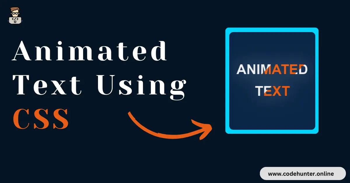
Hi, guys I am back with another fantastic project in this project I Created a Text with Animation using HTML and CSS only.
I also give my readers and followers the full source code for this project at no cost there is no need to subscribe. These code files are free to download and use.
Text Animation
Text animation refers to the process of dynamically changing the appearance or behavior of text elements on a screen, often in a visually engaging way. This can include various effects such as Movement, Color Changes, Fading, Scaling, or other transformations applied to text content.
Text animation is commonly used in web design, video production, presentations, and other multimedia applications to enhance visual appeal, convey information creatively, and capture the audience’s attention.
It allows designers and developers to bring life and dynamism to static text, creating more engaging and interactive user experiences.
Type Of Text Animation
Text animation comes in various types, each offering a unique visual effect to enhance the presentation of text on a webpage or in multimedia content. Here are some common types of text animation:
1. Fade In/Out:
- Gradual appearance or disappearance of text, creating a smooth and subtle transition.
2. Slide In/Out:
- Text enters or exits the screen by sliding from one side, providing a dynamic and engaging effect.
3. Rotate:
- Text rotates around a specified axis, adding a playful or dynamic element to the presentation.
4. Scale:
- The text grows or shrinks in size, emphasizing its importance or creating a sense of depth.
5. Color Change:
- Alteration of text color over time or in response to user interactions, adding vibrancy and emphasis.
6. Typing/Typewriter Effect:
- Mimics the appearance of text being typed, character by character, creating a sense of anticipation.
7. Bounce:
- Text bounces up and down or in a predefined pattern, providing a lively and playful animation.
8. Blur/Unblur:
- Text becomes gradually blurred or unblurred, adding a touch of elegance or mystery.
9. Glow/Shadow Effects:
- Adding a subtle or dynamic glow or shadow to text for emphasis or a visually appealing look.
10. Staggered Animation:
- Individual characters or words animate with a delay, creating a staggered and visually interesting effect.
11. Gradient Change:
- Gradual transition of text color through a gradient, providing a smooth and captivating visual experience.
12. 3D Effects:
- Incorporating 3D transformations, such as extrusion or depth effects, to add a sense of dimensionality to the text.
These types of text animations can be combined or customized to suit specific design goals and user experiences, enhancing the overall aesthetics and engagement of a website or multimedia project.
About This Project
This project was created by the Code Hunter team to help students learn coding and programming. If you want to join our team please follow us on Instagram.
| Created by | Ahmed Developer |
| Languages | HTML and CSS |
| Source Code | Available Below |
| Preview | Take Preview |
| GitHub Link | Code Link |
How to Create a Text Animation
There are some steps to create this type of Text Animation Using HTML, and CSS, that is given below. Follow these steps.
- The first step is to create one folder.
- Open this folder in Vs Code Editor and create two (2) files in HTML and CSS.
- Make sure the HTML file extension is (.html), and the CSS file extension is (.css).
- After creating files, you link a CSS file with an HTML file with the help of this line code. (<link rel=”stylesheet” href=”style.css”>)
- The last step is copying and pasting the given code into your files.
Video Tutorial
If you want to learn more about this project please watch this video and also subscribe to this YouTube channel for more content like this. This video is provided by Sona Coder.
Animated Text Using HTML and CSS – Source Code
HTML FILE
<!DOCTYPE html>
<html lang="en">
<head>
    <meta charset="UTF-8">
    <meta http-equiv="X-UA-Compatible" content="IE=edge">
    <meta name="viewport" content="width=device-width, initial-scale=1.0">
    <title>Text Animation</title>
    <link rel="stylesheet" href="style.css">
</head>
<body>
    <div class="container">
        <p>
          <span class="animated-text">Animated</span>
          <span class="animated-text">Text</span>
        </p>
    </div>

    <div class="attribute">
        Create by
        <a href="https://www.linkedin.com/in/ahmed-raza-developer/">
            Ahmed Developer
        </a >
    </div>
</body>
</html>
CSS FILE
@import url('https://fonts.googleapis.com/css2?family=Poppins:wght@400;600;700&display=swap');

*{
    box-sizing: border-box;
    margin: 0;
    padding: 0;
}
body {
    font-family: sans-serif;
    min-height: 100vh;
    width: 100%;
    display: flex;
    align-items: center;
    justify-content: center;
    background-color: rgba(0,213,255,1);
    font-family: 'poppins';
    position: relative;
}

.container {
  width: 350px;
  height: 400px;
  display: flex;
  align-items: center;
  justify-content: center;
  flex-direction: column;
  background-color: #0A2647;
  border-radius: 1rem;
  padding: 1rem;
  position: relative;
}

p {
    text-transform: uppercase;
    letter-spacing: .5em;
    display: inline-block;
    border-width: 4px 0;
    padding: 1.5em 0em;
    width: 100%;
    text-align: center;
}
.animated-text {

    font: 700 3.5em/1 "Oswald", sans-serif;
    letter-spacing: 0;
    padding: .25em 0 .325em;
    display: block;
    margin: 0 auto;
    text-shadow: 0 0 80px rgba(255,255,255,.5);

    /* Clip Background Image */

    background: url(https://i.ibb.co/RDTnNrT/animated-text-fill.png) repeat-y;
    -webkit-background-clip: text;
    background-clip: text;

    /* Animate Background Image */

    -webkit-text-fill-color: transparent;
    -webkit-animation: aitf 80s linear infinite;
    animation: aitf 80s linear infinite;

    /* Activate hardware acceleration for smoother animations */

    -webkit-transform: translate3d(0,0,0);
    transform: translate3d(0,0,0);
    -webkit-backface-visibility: hidden;
    backface-visibility: hidden;


}

/* Animate Background Image */

@-webkit-keyframes aitf {
    0% { background-position: 0% 50%; }
    100% { background-position: 100% 50%; }
}

.attribute{
    position: absolute;
    bottom: 10px;
}
Related Content
- How To Create a Profile Card Using HTML and CSS – Complete Source Code
- Build an Interactive Responsive Navigation Bar with HTML, CSS, and JS – Free Source Code
- How to Create Animated Social Icon With Hover Effect using HTML and CSS
Final Words
Delving into the art of creating animated text using HTML and CSS provides an exciting journey into the realm of web design. The blog, detailing the process with practical examples and insights, serves as a valuable resource for both novice and seasoned developers.
Animated text, achieved through various CSS properties and keyframe animations, offers a dynamic means to captivate user attention and breathe life into web content.
By understanding the principles outlined in this tutorial, developers can infuse creativity into their projects, experimenting with a multitude of effects like fading, sliding, rotating, and more.
Embracing animated text not only enriches the visual appeal of web pages but also contributes to a more engaging and memorable user experience, showcasing the versatility and power of HTML and CSS in the ever-evolving landscape of web development.