
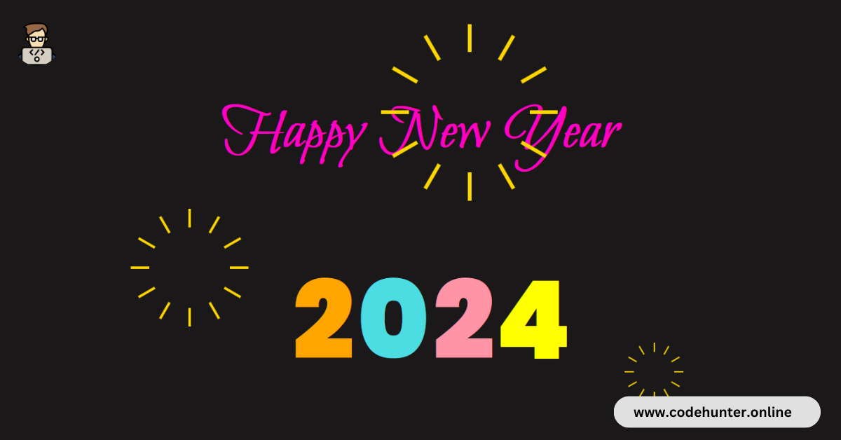
Hi, guys I am back with another fantastic project in this project I Created a Happy New Year Animation Using HTML and CSS only.
I also give my readers and followers the full source code for this project at no cost there is no need to subscribe. These code files are free to download and use.
CSS Animation
CSS (Cascading Style Sheets) animation is a technique used to create motion and transitions in web elements. It allows developers to animate the properties of HTML elements using CSS, without the need for JavaScript or other scripting languages.
CSS animations use keyframes and various properties to define the start and end states of an animation, providing a smooth and visually appealing transition.
This technology is commonly employed to enhance user interfaces, create interactive effects, and add dynamic elements to web pages, contributing to a more engaging and polished user experience.
About This Project
This project was created by the Code Hunter team to help students learn coding and programming. If you want to join our team please follow us on Instagram.
| Created by | Ahmed Developer |
| Languages | HTML and CSS |
| Source Code | Available Below |
| Preview | Take Preview |
| GitHub Link | Code Link |
How to Create a New Year Animation 2024 Using CSS
There are some steps to create this type of New Year Animation Using HTML, and CSS, that is given below. Follow these steps.
- The first step is to create one folder.
- Open this folder in Vs Code Editor and create two (2) files in HTML and CSS.
- Make sure the HTML file extension is (.html), and the CSS file extension is (.css).
- After creating files, you link a CSS file with an HTML file with the help of this line code. (<link rel=”stylesheet” href=”style.css”>)
- The last step is copying and pasting the given code into your files.
Video Tutorial
If you want to learn more about this project please watch this video and also subscribe to this YouTube channel for more content like this. This video is provided by Online Tutorials.
New Year Animation 2024 Using HTML and CSS – Source Code
HTML FILE
<!DOCTYPE html>
<html lang="en">
<head>
    <meta charset="UTF-8">
    <meta http-equiv="X-UA-Compatible" content="IE=edge">
    <meta name="viewport" content="width=device-width, initial-scale=1.0">
    <title>Happy New Year 2023</title>
    <link rel="stylesheet" href="style.css">
</head>
<body>
    <div class="msg">Happy New Year</div>
    <div class="year">
        <span class="first_year">
            <span class="y1">2</span>
            <span class="y2">0</span>
            <span class="y3">2</span>
        </span>
        <span class="old">3</span>
        <span class="y4 new">4</span>
        <div class="balloon"></div>
    </div>
    <div class="firework" id="firework1">
        <div class="cracker"></div>
        <div class="cracker"></div>
        <div class="cracker"></div>
        <div class="cracker"></div>
        <div class="cracker"></div>
        <div class="cracker"></div>
        <div class="cracker"></div>
        <div class="cracker"></div>
        <div class="cracker"></div>
        <div class="cracker"></div>
        <div class="cracker"></div>
        <div class="cracker"></div>
    </div>
    <div class="firework" id="firework2">
        <div class="cracker"></div>
        <div class="cracker"></div>
        <div class="cracker"></div>
        <div class="cracker"></div>
        <div class="cracker"></div>
        <div class="cracker"></div>
        <div class="cracker"></div>
        <div class="cracker"></div>
        <div class="cracker"></div>
        <div class="cracker"></div>
        <div class="cracker"></div>
        <div class="cracker"></div>
    </div>
    <div class="firework" id="firework3">
        <div class="cracker"></div>
        <div class="cracker"></div>
        <div class="cracker"></div>
        <div class="cracker"></div>
        <div class="cracker"></div>
        <div class="cracker"></div>
        <div class="cracker"></div>
        <div class="cracker"></div>
        <div class="cracker"></div>
        <div class="cracker"></div>
        <div class="cracker"></div>
        <div class="cracker"></div>
    </div>
</body>
</html>
CSS FILE
@import url("https://fonts.googleapis.com/css2?family=Bilbo+Swash+Caps&family=Poppins:wght@900&display=swap");

*,
*:after,
*:before {
  box-sizing: border-box;
  margin: 0;
  padding: 0;
  -webkit-transition: all 100ms ease-in;
  transition: all 100ms ease-in;
}

body {
  background-color: #1a1818;
  overflow: hidden;
  height: 100vh;
}

.msg {
  width: 100%;
  font-family: "Bilbo Swash Caps", cursive;
  font-size: 100px;
  font-weight: bolder;
  color: #ff00c3;
  text-align: center;
  position: absolute;
  top: 50%;
  opacity: 0;
  animation: message 2s ease-in-out 6s forwards;
}

@keyframes message {
  0% {
    opacity: 0;
    margin-top: 0;
  }
  100% {
    opacity: 1;
    margin-top: -200px;
  }
}

.y1 {
  color: #fff;
  animation: y1colorful 2s ease-in-out 5.75s forwards;
}
.y2 {
  color: #fff;
  animation: y2colorful 2s ease-in-out 5.75s forwards;
}
.y3 {
  color: #fff;
  animation: y3colorful 2s ease-in-out 5.75s forwards;
}
.y4 {
  color: #fff;
  animation: y4colorful 2s ease-in-out 5.75s forwards;
}

@keyframes y1colorful {
    0% {
        color: #fff;
    }
    100% {
        color: orange;
    }
}
@keyframes y2colorful {
    0% {
        color: #fff;
    }
    100% {
        color: #4cdde2;
    }
}
@keyframes y3colorful {
    0% {
        color: #fff;
    }
    100% {
        color: #ff94a6;
    }
}
@keyframes y4colorful {
    0% {
        color: #fff;
    }
    100% {
        color: yellow;
    }
}

.old {
  color: #fff;
  position: absolute;
  top: 0%;
  animation: old_animation 2.5s ease-in-out 4s forwards;
  margin-left: -80px;
}

@keyframes old_animation {
  0% {
    top: 0%;
  }
  100% {
    top: -250%;
  }
}

.year {
  position: absolute;
  top: 450px;
  width: 100%;
  text-align: center;
}

.year > span {
  font-size: 175px;
  font-weight: 700;
  font-family: "Poppins", sans-serif;
  letter-spacing: -12px;
}

.first_year {
  margin-right: 100px;
}

.new {
  position: absolute;
  right: -100px;
  animation: new_animation 5s ease-in-out 1.5s forwards;
}

@keyframes new_animation {
  0% {
    right: -100px;
  }
  40% {
    right: 400px;
  }
  90% {
    right: 400px;
  }
  100% {
    right: 520px;
    color: yellow;
  }
}

.balloon {
  width: 100px;
  height: 120px;
  border-radius: 50%;
  background-color: red;
  position: absolute;
  top: 50%;
  right: -100px;
  margin-top: -285px;
  animation: balloon_animation 5s ease-in-out 1.5s forwards;
}

.balloon::after {
  content: "";
  width: 4px;
  height: 100px;
  background-color: #fff;
  position: absolute;
  left: 50%;
  margin-left: -2px;
  bottom: -100px;
}

.balloon::before {
  content: "";
  border-style: solid;
  border-width: 0 10px 20px 10px;
  border-color: transparent transparent #fd3553 transparent;
  position: absolute;
  left: 50%;
  bottom: -10px;
  margin-left: -10px;
}

@keyframes balloon_animation {
  0% {
    right: -100px;
  }
  40% {
    right: 380px;
  }
  50% {
    right: 530px;
    top: 50%;
  }
  100% {
    right: 530px;
    top: -200%;
  }
}

.firework {
    position: relative;
    opacity: 0;
    animation: show_fireworks 2s ease-in-out 5s forwards;
}

@keyframes show_fireworks {
    0% {
        opacity: 0;
    }
    99% {
        opacity: 0;
    }
    100% {
        opacity: 1;
    }
}

.cracker {
    position: absolute;
    width: 4px;
    height: 80px;
    transform-origin: 50% 100%;
    overflow: hidden;
}

.cracker::before {
    content: '';
    background-color: gold;
    height: 40px;
    position: absolute;
    left: 0;
    right: 0;
    animation: fire 2s ease-in-out infinite;
}

@keyframes fire {
    0% {
        top: 100%;
    }
    25% {
        top: 50%;
    }
    50% {
        top: -25%;
    }
    75% {
        top: -50%;
    }
    100% {
        top: -50%;
    }
}

.cracker:nth-child(1) {
    transform: rotate(0deg) translateY(-15px);
}
.cracker:nth-child(2) {
    transform: rotate(30deg) translateY(-15px);
}
.cracker:nth-child(3) {
    transform: rotate(60deg) translateY(-15px);
}
.cracker:nth-child(4) {
    transform: rotate(90deg) translateY(-15px);
}
.cracker:nth-child(5) {
    transform: rotate(120deg) translateY(-15px);
}
.cracker:nth-child(6) {
    transform: rotate(150deg) translateY(-15px);
}
.cracker:nth-child(7) {
    transform: rotate(180deg) translateY(-15px);
}
.cracker:nth-child(8) {
    transform: rotate(210deg) translateY(-15px);
}
.cracker:nth-child(9) {
    transform: rotate(240deg) translateY(-15px);
}
.cracker:nth-child(10) {
    transform: rotate(270deg) translateY(-15px);
}
.cracker:nth-child(11) {
    transform: rotate(300deg) translateY(-15px);
}
.cracker:nth-child(12) {
    transform: rotate(330deg) translateY(-15px);
}

#firework1 {
    left: 25%;
    top: 50%;
    transform: scale(1);
}

#firework2 {
    left: 50%;
    top: 75%;
    transform: scale(0.5);
}

#firework3 {
    left: 80%;
    top: 15%;
    transform: scale(1.5);
}
Related Content
- 10 Types of Progress Bar CSS Animation Using Only HTML and CSS
- 16 CSS Animation Buttons With Hover Effect That Will Make Your Website Stand Out
- How to Create an Animated Text Using HTML and CSS
Final Words
Crafting a “Happy New Year 2024” animation using only HTML and CSS provides a delightful and code-free solution for ushering in the new year with style. The simplicity of this approach ensures accessibility for developers of all levels, allowing them to effortlessly integrate celebratory animations into their websites.
By leveraging the power of keyframe animations and creative styling, the provided code exemplifies how a touch of festive flair can be easily injected into web projects. This code-free animation not only enhances the visual appeal of a webpage but also serves as a cheerful way to engage visitors and share the spirit of the New Year. Cheers to a vibrant and animated start to 2024! 🎉