
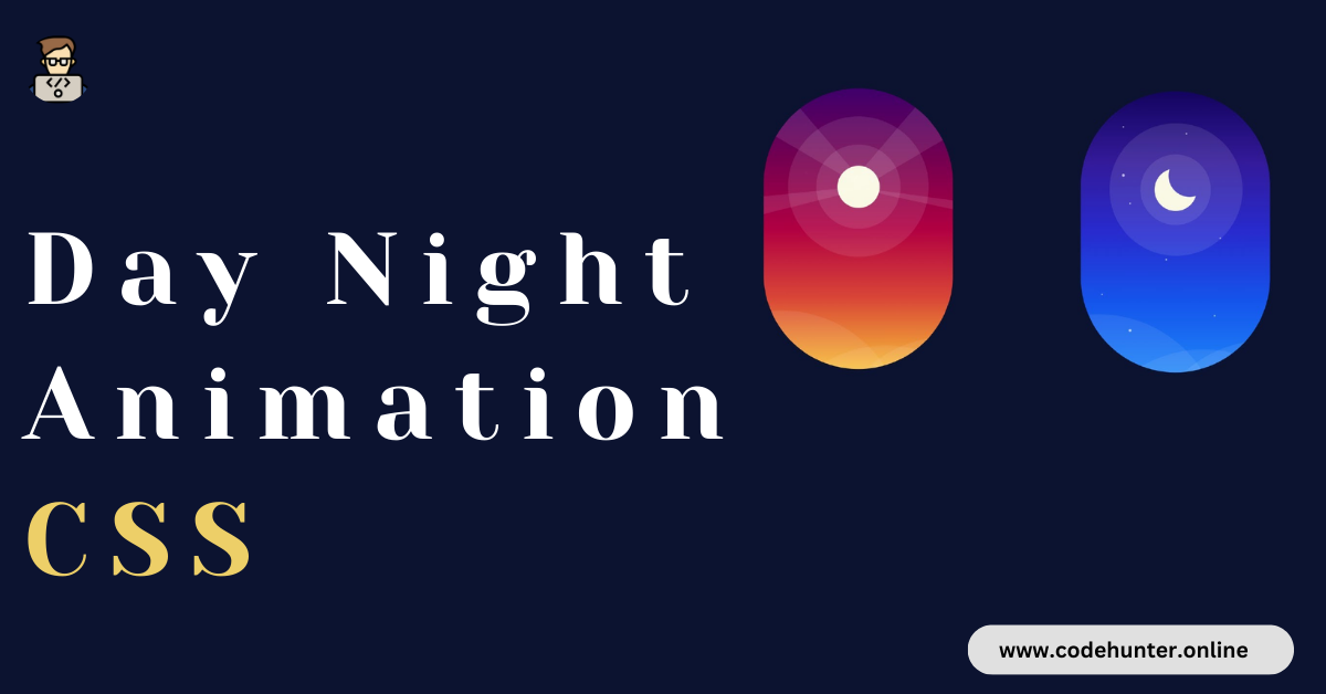
Hi, guys I am back with another fantastic project in this project I Created a Day Night Transition Animation Using HTML and CSS only.
I also give my readers and followers the full source code for this project at no cost there is no need to subscribe. These code files are free to download and use.
Though this is a fun tutorial, you will explore and learn about a lot of CSS properties through tutorials. If you are looking for more tutorials to improve your CSS skills you can check out this playlist here. This playlist consists of a bunch of CSS animations that will help you play around with a lot of CSS properties.
CSS Animation
CSS (Cascading Style Sheets) animation is a technique used to create motion and transitions in web elements. It allows developers to animate the properties of HTML elements using CSS, without the need for JavaScript or other scripting languages.
CSS animations use keyframes and various properties to define the start and end states of an animation, providing a smooth and visually appealing transition.
This technology is commonly employed to enhance user interfaces, create interactive effects, and add dynamic elements to web pages, contributing to a more engaging and polished user experience.
About This Project
This project was created by the Code Hunter team to help students learn coding and programming. If you want to join our team please follow us on Instagram.
| Created by | Ahmed Developer |
| Languages | HTML and CSS |
| Source Code | Available Below |
| Preview | Take Preview |
| GitHub Link | Code Link |
How to Create a Day Night Animation Using HTML and CSS
There are some steps to create this type of Day Night Transition Animation Using HTML, and CSS, that is given below. Follow these steps.
- The first step is to create one folder.
- Open this folder in Vs Code Editor and create two (2) files in HTML and CSS.
- Make sure the HTML file extension is (.html), and the CSS file extension is (.css).
- After creating files, you link a CSS file with an HTML file with the help of this line code. (<link rel=”stylesheet” href=”style.css”>)
- The last step is copying and pasting the given code into your files.
Video Tutorial
If you want to learn more about this project please watch this video and also subscribe to this YouTube channel for more content like this. This video is provided by Coding Artist.
Day Night Transition Animation Using HTML and CSS – Source Code
HTML FILE
We begin with the HTML code. HTML code is used to create elements that build the structure of our animation. First, copy the code below and paste it into your HTML document.
<!DOCTYPE html>
<html lang="en">
  <head>
    <meta name="viewport" content="width=device-width, initial-scale=1.0" />
    <title>Day Night Animation</title>
    <!-- Stylesheet -->
    <link rel="stylesheet" href="style.css" />
  </head>
  <body>
    <div class="container">
      <div class="glow"></div>
      <div class="stars"></div>
      <div class="spinner">
        <div class="sun">
          <div class="ray1"></div>
          <div class="ray2"></div>
          <div class="ray3"></div>
          <div class="ray4"></div>
        </div>
        <div class="moon"></div>
      </div>
    </div>
  </body>
</html>
CSS FILE
Now we style and shape the elements created with HTML into desired shapes using CSS. We also use CSS to position these elements and add animations. Now copy the code provided to you below and paste it into your stylesheet.
body {
    padding: 0;
    margin: 0;
    background-color: #0c1330;
  }
  .container {
    height: 25em;
    width: 16.8em;
    background: linear-gradient(#3f006c, #750050, #b10042, #da4837, #f7bb38);
    position: absolute;
    transform: translate(-50%, -50%);
    top: 50%;
    left: 50%;
    z-index: 1;
    overflow: hidden;
    border-radius: 16.8em;
    animation: colors 12s infinite forwards;
  }
  @keyframes colors {
    10% {
      background: linear-gradient(#3f006c, #750050, #b10042, #da4837, #f7bb38);
    }
    53% {
      background: linear-gradient(#14045f, #331a99, #282bce, #1555ec, #1e84f7);
    }
    55% {
      background: linear-gradient(#14045f, #331a99, #282bce, #1555ec, #1e84f7);
    }
    98% {
      background: linear-gradient(#3f006c, #750050, #b10042, #da4837, #f7bb38);
    }
    100% {
      background: linear-gradient(#3f006c, #750050, #b10042, #da4837, #f7bb38);
    }
  }
  .spinner {
    height: 28.12em;
    width: 28.12em;
    border-radius: 50%;
    position: absolute;
    top: 8.75em;
    left: -5.62em;
    animation: spin 12s infinite forwards;
  }
  @keyframes spin {
    10% {
      transform: rotate(0deg);
    }
    45% {
      transform: rotate(180deg);
    }
    55% {
      transform: rotate(180deg);
    }
    90% {
      transform: rotate(360deg);
    }
    100% {
      transform: rotate(360deg);
    }
  }
  .sun {
    background-color: #f7f7de;
    height: 3.75em;
    width: 3.75em;
    border-radius: 50%;
    position: absolute;
    left: 12.18em;
    top: -1.87em;
  }
  .sun:before,
  .sun:after {
    position: absolute;
    content: "";
    background-color: rgba(255, 255, 255, 0.1);
    border-radius: 50%;
  }
  .sun:before {
    height: 7.5em;
    width: 7.5em;
    right: -1.87em;
    bottom: -1.87em;
  }
  .sun:after {
    height: 12.5em;
    width: 12.5em;
    right: -4.37em;
    bottom: -4.37em;
  }
  .ray1 {
    height: 0;
    width: 0.6em;
    border-bottom: 10.6em solid rgba(255, 255, 255, 0.1);
    border-left: 1.8em solid transparent;
    border-right: 1.8em solid transparent;
    position: absolute;
    transform: rotate(130deg);
    bottom: 0.6em;
    right: 4em;
  }
  .ray2 {
    position: absolute;
    height: 0;
    width: 0.9em;
    border-bottom: 12.5em solid rgba(255, 255, 255, 0.1);
    border-left: 2.1em solid transparent;
    border-right: 2.1em solid transparent;
    transform: rotate(230deg);
    left: 3.75em;
    bottom: -0.3em;
  }
  .ray3 {
    position: absolute;
    height: 0;
    width: 0.3em;
    border-bottom: 12.5em solid rgba(255, 255, 255, 0.1);
    border-left: 0.9em solid transparent;
    border-right: 0.9em solid transparent;
    transform: rotate(80deg);
    left: -5.3em;
    bottom: -5.6em;
  }
  .ray4 {
    position: absolute;
    height: 0;
    width: 0.1em;
    border-bottom: 12.5em solid rgba(255, 255, 255, 0.1);
    border-left: 0.5em solid transparent;
    border-right: 0.5em solid transparent;
    transform: rotate(280deg);
    left: 7.5em;
    bottom: -5.6em;
  }
  .moon {
    height: 3.75em;
    width: 3.75em;
    box-shadow: 1.25em -1.25em 0 0 #f7f7de;
    border-radius: 50%;
    position: absolute;
    bottom: -3.1em;
    left: 10.93em;
  }
  .moon:before,
  .moon:after {
    position: absolute;
    content: "";
    background-color: rgba(255, 255, 255, 0.1);
    border-radius: 50%;
  }
  .moon:before {
    height: 6.25em;
    width: 6.25em;
    right: -2.5em;
    bottom: 0;
  }
  .moon:after {
    height: 11.8em;
    width: 11.8em;
    left: -2.8em;
    bottom: -2.8em;
  }
  .stars {
    height: 0.15em;
    width: 0.15em;
    background-color: #ffffff;
    position: absolute;
    top: 3.7em;
    left: 9.3em;
    border-radius: 50%;
    box-shadow: 3em 9.3em #ffffff, -1.8em 11.2em #ffffff, 2.5em 16.2em #ffffff,
      -5em 6.2em #ffffff, -5.6em -0.6em #ffffff, -5.6em 3.7em 0 0.06em #ffffff,
      -5em 17.5em 0 0.05em #ffffff, -7.5em 14.3em #ffffff;
    animation: twinkle 12s infinite forwards;
  }
  @keyframes twinkle {
    0% {
      opacity: 0;
    }
    10% {
      opacity: 0;
    }
    53% {
      opacity: 0.7;
    }
    55% {
      opacity: 0.7;
    }
    98% {
      opacity: 0;
    }
    100% {
      opacity: 0;
    }
  }
  .glow {
    height: 21.8em;
    width: 21.8em;
    position: absolute;
    background-color: rgba(255, 255, 255, 0.08);
    border-radius: 50%;
    bottom: -19em;
    animation: float 5s infinite;
  }
  @keyframes float {
    50% {
      transform: translateY(0.75em);
    }
  }
  .glow:before,
  .glow:after {
    position: absolute;
    content: "";
    height: 100%;
    width: 100%;
    background-color: inherit;
    border-radius: 50%;
  }
  .glow:before {
    left: -9.3em;
    top: -3.1em;
  }
  .glow:after {
    right: -5.6em;
    top: -0.8em;
  }
  @media screen and (min-width: 600px) {
    .container {
      font-size: 20px;
    }
  }
Related Content
- 10 Types of Progress Bar CSS Animation Using Only HTML and CSS
- 16 CSS Animation Buttons With Hover Effect That Will Make Your Website Stand Out
- How to Create an Animated Text Using HTML and CSS
Final Words
The “Day Night Transition Animation” using HTML and CSS provides a captivating way to dynamically shift a website’s atmosphere. This elegant code-driven solution seamlessly transitions between day and night, showcasing the creative possibilities within web development.
By harnessing the power of HTML and CSS, developers can effortlessly enhance user experience with visually engaging and immersive day-to-night transformations. This not only adds aesthetic appeal but also demonstrates the versatility of front-end technologies in creating interactive and atmospheric web content. Cheers to a website that evolves with the time of day! 🌅🌙