
Hi, guys I am back with another fantastic project in this project I created a Responsive Navigation Menu Using HTML, CSS & JavaScript.
I also give my readers and followers the full source code for this project at no cost there is no need to subscribe. These code files are free to download and use.
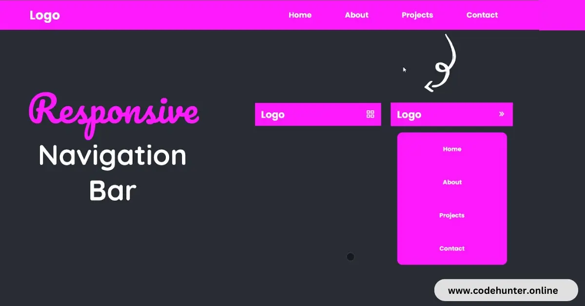
Responsive Navigation Menu
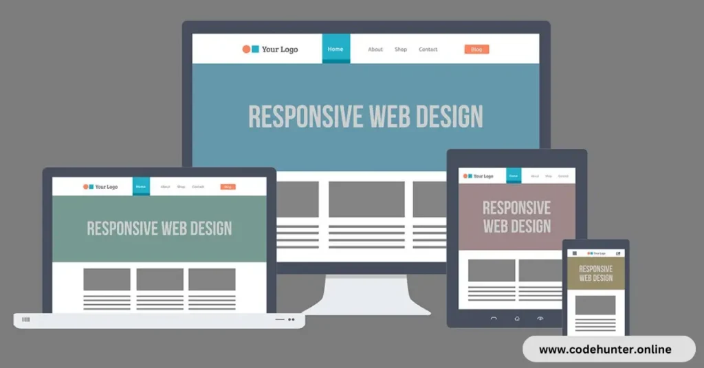
A responsive navigation menu is a website navigation system that adjusts its layout and appearance based on the screen size and device used by the viewer. A responsive navigation menu aims to provide an optimal user experience across various devices, such as Desktops, Laptops, Tablets, and Smartphones.
As the screen size decreases, especially on smaller devices like Smartphones, traditional navigation menus may become difficult to use due to limited space.
Responsive navigation menus address this issue by adapting to the available screen space and often involve collapsing or reorganizing menu items.
Common techniques for creating responsive navigation menus are given below I used hamburger menus in my all projects.
Hamburger Menu:
This is a popular design pattern where the traditional horizontal menu is replaced by a simple icon (often resembling a hamburger) that, when clicked or tapped, expands to reveal the menu items.
Dropdown Menus:
Traditional dropdown menus can be adapted to work well on smaller screens by converting them into nested, collapsible lists or accordions.
Tabbed Navigation:
On larger screens, tabs may be displayed horizontally, while on smaller screens, they can be reorganized into a vertically stacked layout.
Hidden Navigation:
Some responsive designs hide the navigation menu by default and display it when a user interacts with a specific button or icon.
Responsive navigation menus play a crucial role in creating a positive user experience across various devices, ensuring that users can easily navigate a website regardless of the screen size they are using.
About This Project
This project was created by the Code Hunter team to help students learn coding and programming. If you want to join our team please follow us on Instagram.
| Created by | Code Hunter |
| Languages | HTML, CSS & JS |
| Source Code | Available Below |
| Preview | Take Preview |
| GitHub Link | Code Link |
How to Create a Responsive Menu Using HTML, CSS, and JS
There are some steps to create this type of Responsive Menu Using HTML, CSS, and JavaScript which are given below.
- The first step is to create one folder.
- Open this folder in Vs Code Editor and create three (3) files for HTML, CSS, and JavaScript.
- Make sure the HTML file extension is (.html), and the CSS file extension is (.css).
- After creating files, you link a CSS file with an HTML file with the help of this line code. (<link rel=”stylesheet” href=”style.css”>)
- The last step is copying and pasting the given code into your files.
Video Tutorial
If you want to learn more about this project please watch this video and also subscribe to this YouTube channel for more content like this. This video is provided by Sona Coder.
Responsive Menu Using HTML, CSS, and JavaScript – Source Code
HTML FILE
<!DOCTYPE html>
<html lang="en">
<head>
    <meta charset="UTF-8">
    <meta http-equiv="X-UA-Compatible" content="IE=edge">
    <meta name="viewport" content="width=device-width, initial-scale=1.0">
    <title>Document</title>
    <!-- box icon cdn  -->
    <link href='https://unpkg.com/boxicons@2.1.4/css/boxicons.min.css' rel='stylesheet'>

    <!-- custom css file -->
    <link rel="stylesheet" href="style.css">
</head>
<body>

    <!-- navigation menu -->
    <div class="header-nav">
        <!-- header logo -->
        <div class="header-logo">
            <h1>Logo</h1>
        </div>

        <!-- mobile menu icon  -->
        <div class="mobile-menu-icon">
            <i class='bx bx-grid-alt' id="menu-icon"></i>
        </div>

        <!-- nav-list  -->
        <ul class="header-nav-list" id="header-nav-list">
            <li><a href="#">Home</a></li>
            <li><a href="#">About</a></li>
            <li><a href="#">Projects</a></li>
            <li><a href="#">Contact</a></li>
        </ul>
    </div>
    <!-- custom js file  -->
    <script src="script.js"></script>
</body>
</html>
CSS FILE
@import url('https://fonts.googleapis.com/css2?family=Poppins:wght@500;700;&display=swap');

/*
    Base
*/
*{
    margin: 0;
    padding: 0;
    box-sizing: border-box;
}

body{
    background-color: #282c34;
    font-family: "Poppins";
}

/* header nav  */
.header-nav{
    padding: 0 150px;
    height: 75px;
    width: 100%;
    display: flex;
    align-items: center;
    justify-content: space-between;
    background-color: #fd1afd;
    position: relative;
    color: #fff;
}

/* header navigation list  */
.header-nav-list{
    height: 100%;
    width: 50%;
    display: flex;
    align-items: center;
    justify-content: space-around;
    font-size: 1.2rem;
    font-weight: bold;
}

.header-nav-list li{
    list-style-type: none;
}
.header-nav-list li a{
    text-decoration: none;
    color: #fff;
}

/* mobile menu icon  */
.mobile-menu-icon{
    visibility: hidden;
    position: absolute;
    right: 20px;
    top: 15px;
    font-size: 2rem;
    cursor: pointer;
}

/* responsive design  */
@media (max-width:768px) {
    .header-nav{
        padding: 0 20px;
    }
    .mobile-menu-icon{
        visibility: visible;
    }
    .header-nav-list{
        height: 0;
        width: 0;
        opacity: 0;
        visibility: hidden;
        border: none;
        border-radius: 1rem;
        position: absolute;
        top: 95px;
        right: 20px;
        flex-direction: column;
        background-color: #fd1afd;
        overflow: hidden;
        transition: all 0.5s cubic-bezier(0.55, 0.085, 0.68 , 0.53) 0.1s;
    }
    .header-nav-list.open{
        height: 50vh;
        width: 350px;
        opacity: 1;
        visibility: visible;
    }

    .header-nav-list li{
        opacity: 0;
        transform: translateX(500%);
        transition: transform .75s ease-in-out;
        transition-delay: 1s;
    }
    .header-nav-list li.open{
        opacity: 1;
        transform: translateX(0);
    }

}
JavaScript FILE
const menuIcon = document.getElementById("menu-icon");
const headerNav = document.getElementById("header-nav-list");
const headerNavItems = document.querySelectorAll(".header-nav-list li")

// toggle mobile menu show and hide
menuIcon.addEventListener("click" , ()=> {
    headerNav.classList.toggle("open");

    // change menu icon
    if(menuIcon.classList.contains("bx-grid-alt")){
        menuIcon.className = "bx bx-chevrons-right";

        // animated header nav list item
        headerNavItems.forEach((item,index) => {
            item.classList.add("open");
            item.style.transitionDelay = `${index * 0.5}s`;
        })
    }else{
        menuIcon.className = "bx bx-grid-alt";
        headerNavItems.forEach((item,index) => {
            item.classList.remove("open");
            item.style.transitionDelay = "0s";
        })
    }
})
You Might Like This:
- How To Create a Modern Drop-Down Menu Using HTML, CSS, and JavaScript
- How To Create a Profile Card Using HTML and CSS – Complete Source Code
Final Words
To sum up, crafting an interactive responsive navigation bar using HTML, CSS, and JS is crucial for delivering a seamless user experience on various devices.
This tutorial offers practical insights into employing techniques like the Hamburger menu and dropdowns to create an adaptable navigation system.
With the provided free source code, developers can effortlessly integrate and personalize these features, promoting creativity and ensuring websites are both user-friendly and accessible across different screen sizes.
In the dynamic field of web development, mastering responsive navigation is fundamental. Embracing the principles outlined in this tutorial equips developers with the necessary skills to overcome challenges related to diverse screen sizes and device types, ultimately contributing to the creation of modern, responsive, and user-centric websites.