
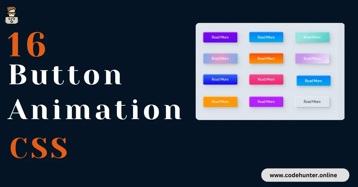
Hi, guys I am back with another fantastic project in this project I Created 16 CSS Animation Buttons With Hover Effect using HTML and CSS only.
I also give my readers and followers the full source code for this project at no cost there is no need to subscribe. These code files are free to download and use.
Button Animation In CSS
Button animations in CSS can be achieved through various CSS properties and pseudo-classes. Here’s an explanation of the key components:
1. Basic Button Styling:
- Use properties like
padding,font-size,text-align, andborderto define the basic appearance of the button.
2. Hover Effect:
- Apply styles using the
:hoverpseudo-class to create an effect when the user hovers over the button. This can include changes inbackground-colorandcolorto make the button visually interactive.
3. Click Animation:
- Use the
:activepseudo-class to define styles that should be applied when the button is clicked. Commonly, atransformproperty with thescalefunction creates a subtle scaling effect, indicating that the button is being pressed.
4. Transition Property:
- Use the
transitionproperty to smoothly animate changes in specified CSS properties. This property defines the duration of the animation (0.3sin the example) and the properties to be animated (background-color,color, andtransform).
5. Border-radius:
- Utilize the
border-radiusproperty to round the button’s corners, giving it a more modern and visually appealing look.
Combining these techniques allows you to create a button that responds to user interactions with smooth animations, making the user experience more engaging. You can customize these animations based on your design preferences and the specific visual effects you want to achieve.
About This Project
This project was created by the Code Hunter team to help students learn coding and programming. If you want to join our team please follow us on Instagram.
| Created by | Ahmed Developer |
| Languages | HTML and CSS |
| Source Code | Available Below |
| Preview | Take Preview |
| GitHub Link | Code Link |
How to Create a Buttons Animation
There are some steps to create this type of Button Animation With Hover Effects Using HTML, and CSS, that is given below. Follow these steps.
- The first step is to create one folder.
- Open this folder in Vs Code Editor and create two (2) files in HTML and CSS.
- Make sure the HTML file extension is (.html), and the CSS file extension is (.css).
- After creating files, you link a CSS file with an HTML file with the help of this line code. (<link rel=”stylesheet” href=”style.css”>)
- The last step is copying and pasting the given code into your files.
Video Tutorial
If you want to learn more about this project please watch this video and also subscribe to this YouTube channel for more content like this. This video is provided by Coding Nepal.
Buttons Animation Using HTML and CSS – Source Code
HTML FILE
<!DOCTYPE html>
<html lang="en">
<head>
    <meta charset="UTF-8">
    <meta name="viewport" content="width=device-width, initial-scale=1.0">
    <title>CSS Button Animations</title>
    <link rel="stylesheet" href="style.css">
</head>
<body>
    <div class="frame">
        <button class="custom-btn btn-1">Read More</button>
        <button class="custom-btn btn-2">Read More</button>
        <button class="custom-btn btn-3"><span>Read More</span></button>
        <button class="custom-btn btn-4"><span>Read More</span></button>
        <button class="custom-btn btn-5"><span>Read More</span></button>
        <button class="custom-btn btn-6"><span>Read More</span></button>
        <button class="custom-btn btn-7"><span>Read More</span></button>
        <button class="custom-btn btn-8"><span>Read More</span></button>
        <button class="custom-btn btn-9">Read More</button>
        <button class="custom-btn btn-10">Read More</button>
        <button class="custom-btn btn-11">Read More<div class="dot"></div></button>
        <button class="custom-btn btn-12"><span>Click!</span><span>Read More</span></button>
        <button class="custom-btn btn-13">Read More</button>
        <button class="custom-btn btn-14">Read More</button>
        <button class="custom-btn btn-15">Read More</button>
        <button class="custom-btn btn-16">Read More</button>
        </div>
</body>
</html>
CSS FILE
body {
    background: #e0e5ec;
    }
    .frame {
    width: 90%;
    margin: 40px auto;
    text-align: center;
    }
    button {
    margin: 20px;
    }
    .custom-btn {
    width: 130px;
    height: 40px;
    color: #fff;
    border-radius: 5px;
    padding: 10px 25px;
    font-family: 'Lato', sans-serif;
    font-weight: 500;
    background: transparent;
    cursor: pointer;
    transition: all 0.3s ease;
    position: relative;
    display: inline-block;
    box-shadow:inset 2px 2px 2px 0px rgba(255,255,255,.5),
    7px 7px 20px 0px rgba(0,0,0,.1),
    4px 4px 5px 0px rgba(0,0,0,.1);
    outline: none;
    }
    /* 1 */
    .btn-1 {
    background: rgb(6,14,131);
    background: linear-gradient(0deg, rgba(6,14,131,1) 0%, rgba(12,25,180,1) 100%);
    border: none;
    }
    .btn-1:hover {
    background: rgb(0,3,255);
    background: linear-gradient(0deg, rgba(0,3,255,1) 0%, rgba(2,126,251,1) 100%);
    }
    /* 2 */
    .btn-2 {
    background: rgb(96,9,240);
    background: linear-gradient(0deg, rgba(96,9,240,1) 0%, rgba(129,5,240,1) 100%);
    border: none;
    }
    .btn-2:before {
    height: 0%;
    width: 2px;
    }
    .btn-2:hover {
    box-shadow: 4px 4px 6px 0 rgba(255,255,255,.5),
    -4px -4px 6px 0 rgba(116, 125, 136, .5),
    inset -4px -4px 6px 0 rgba(255,255,255,.2),
    inset 4px 4px 6px 0 rgba(0, 0, 0, .4);
    }
    /* 3 */
    .btn-3 {
    background: rgb(0,172,238);
    background: linear-gradient(0deg, rgba(0,172,238,1) 0%, rgba(2,126,251,1) 100%);
    width: 130px;
    height: 40px;
    line-height: 42px;
    padding: 0;
    border: none;
    }
    .btn-3 span {
    position: relative;
    display: block;
    width: 100%;
    height: 100%;
    }
    .btn-3:before,
    .btn-3:after {
    position: absolute;
    content: "";
    right: 0;
    top: 0;
    background: rgba(2,126,251,1);
    transition: all 0.3s ease;
    }
    .btn-3:before {
    height: 0%;
    width: 2px;
    }
    .btn-3:after {
    width: 0%;
    height: 2px;
    }
    .btn-3:hover{
    background: transparent;
    box-shadow: none;
    }
    .btn-3:hover:before {
    height: 100%;
    }
    .btn-3:hover:after {
    width: 100%;
    }
    .btn-3 span:hover{
    color: rgba(2,126,251,1);
    }
    .btn-3 span:before,
    .btn-3 span:after {
    position: absolute;
    content: "";
    left: 0;
    bottom: 0;
    background: rgba(2,126,251,1);
    transition: all 0.3s ease;
    }
    .btn-3 span:before {
    width: 2px;
    height: 0%;
    }
    .btn-3 span:after {
    width: 0%;
    height: 2px;
    }
    .btn-3 span:hover:before {
    height: 100%;
    }
    .btn-3 span:hover:after {
    width: 100%;
    }
    /* 4 */
    .btn-4 {
    background-color: #4dccc6;
    background-image: linear-gradient(315deg, #4dccc6 0%, #96e4df 74%);
    line-height: 42px;
    padding: 0;
    border: none;
    }
    .btn-4:hover{
    background-color: #89d8d3;
    background-image: linear-gradient(315deg, #89d8d3 0%, #03c8a8 74%);
    }
    .btn-4 span {
    position: relative;
    display: block;
    width: 100%;
    height: 100%;
    }
    .btn-4:before,
    .btn-4:after {
    position: absolute;
    content: "";
    right: 0;
    top: 0;
    box-shadow: 4px 4px 6px 0 rgba(255,255,255,.9),
    -4px -4px 6px 0 rgba(116, 125, 136, .2),
    inset -4px -4px 6px 0 rgba(255,255,255,.9),
    inset 4px 4px 6px 0 rgba(116, 125, 136, .3);
    transition: all 0.3s ease;
    }
    .btn-4:before {
    height: 0%;
    width: .1px;
    }
    .btn-4:after {
    width: 0%;
    height: .1px;
    }
    .btn-4:hover:before {
    height: 100%;
    }
    .btn-4:hover:after {
    width: 100%;
    }
    .btn-4 span:before,
    .btn-4 span:after {
    position: absolute;
    content: "";
    left: 0;
    bottom: 0;
    box-shadow: 4px 4px 6px 0 rgba(255,255,255,.9),
    -4px -4px 6px 0 rgba(116, 125, 136, .2),
    inset -4px -4px 6px 0 rgba(255,255,255,.9),
    inset 4px 4px 6px 0 rgba(116, 125, 136, .3);
    transition: all 0.3s ease;
    }
    .btn-4 span:before {
    width: .1px;
    height: 0%;
    }
    .btn-4 span:after {
    width: 0%;
    height: .1px;
    }
    .btn-4 span:hover:before {
    height: 100%;
    }
    .btn-4 span:hover:after {
    width: 100%;
    }
    /* 5 */
    .btn-5 {
    width: 130px;
    height: 40px;
    line-height: 42px;
    padding: 0;
    border: none;
    background: rgb(255,27,0);
    background: linear-gradient(0deg, rgba(255,27,0,1) 0%, rgba(251,75,2,1) 100%);
    }
    .btn-5:hover {
    color: #f0094a;
    background: transparent;
    box-shadow:none;
    }
    .btn-5:before,
    .btn-5:after{
    content:'';
    position:absolute;
    top:0;
    right:0;
    height:2px;
    width:0;
    background: #f0094a;
    box-shadow:
    -1px -1px 5px 0px #fff,
    7px 7px 20px 0px #0003,
    4px 4px 5px 0px #0002;
    transition:400ms ease all;
    }
    .btn-5:after{
    right:inherit;
    top:inherit;
    left:0;
    bottom:0;
    }
    .btn-5:hover:before,
    .btn-5:hover:after{
    width:100%;
    transition:800ms ease all;
    }
    /* 6 */
    .btn-6 {
    background: rgb(247,150,192);
    background: radial-gradient(circle, rgba(247,150,192,1) 0%, rgba(118,174,241,1) 100%);
    line-height: 42px;
    padding: 0;
    border: none;
    }
    .btn-6 span {
    position: relative;
    display: block;
    width: 100%;
    height: 100%;
    }
    .btn-6:before,
    .btn-6:after {
    position: absolute;
    content: "";
    height: 0%;
    width: 1px;
    box-shadow:
    -1px -1px 20px 0px rgba(255,255,255,1),
    -4px -4px 5px 0px rgba(255,255,255,1),
    7px 7px 20px 0px rgba(0,0,0,.4),
    4px 4px 5px 0px rgba(0,0,0,.3);
    }
    .btn-6:before {
    right: 0;
    top: 0;
    transition: all 500ms ease;
    }
    .btn-6:after {
    left: 0;
    bottom: 0;
    transition: all 500ms ease;
    }
    .btn-6:hover{
    background: transparent;
    color: #76aef1;
    box-shadow: none;
    }
    .btn-6:hover:before {
    transition: all 500ms ease;
    height: 100%;
    }
    .btn-6:hover:after {
    transition: all 500ms ease;
    height: 100%;
    }
    .btn-6 span:before,
    .btn-6 span:after {
    position: absolute;
    content: "";
    box-shadow:
    -1px -1px 20px 0px rgba(255,255,255,1),
    -4px -4px 5px 0px rgba(255,255,255,1),
    7px 7px 20px 0px rgba(0,0,0,.4),
    4px 4px 5px 0px rgba(0,0,0,.3);
    }
    .btn-6 span:before {
    left: 0;
    top: 0;
    width: 0%;
    height: .5px;
    transition: all 500ms ease;
    }
    .btn-6 span:after {
    right: 0;
    bottom: 0;
    width: 0%;
    height: .5px;
    transition: all 500ms ease;
    }
    .btn-6 span:hover:before {
    width: 100%;
    }
    .btn-6 span:hover:after {
    width: 100%;
    }
    /* 7 */
    .btn-7 {
    background: linear-gradient(0deg, rgba(255,151,0,1) 0%, rgba(251,75,2,1) 100%);
    line-height: 42px;
    padding: 0;
    border: none;
    }
    .btn-7 span {
    position: relative;
    display: block;
    width: 100%;
    height: 100%;
    }
    .btn-7:before,
    .btn-7:after {
    position: absolute;
    content: "";
    right: 0;
    bottom: 0;
    background: rgba(251,75,2,1);
    box-shadow:
    -7px -7px 20px 0px rgba(255,255,255,.9),
    -4px -4px 5px 0px rgba(255,255,255,.9),
    7px 7px 20px 0px rgba(0,0,0,.2),
    4px 4px 5px 0px rgba(0,0,0,.3);
    transition: all 0.3s ease;
    }
    .btn-7:before{
    height: 0%;
    width: 2px;
    }
    .btn-7:after {
    width: 0%;
    height: 2px;
    }
    .btn-7:hover{
    color: rgba(251,75,2,1);
    background: transparent;
    }
    .btn-7:hover:before {
    height: 100%;
    }
    .btn-7:hover:after {
    width: 100%;
    }
    .btn-7 span:before,
    .btn-7 span:after {
    position: absolute;
    content: "";
    left: 0;
    top: 0;
    background: rgba(251,75,2,1);
    box-shadow:
    -7px -7px 20px 0px rgba(255,255,255,.9),
    -4px -4px 5px 0px rgba(255,255,255,.9),
    7px 7px 20px 0px rgba(0,0,0,.2),
    4px 4px 5px 0px rgba(0,0,0,.3);
    transition: all 0.3s ease;
    }
    .btn-7 span:before {
    width: 2px;
    height: 0%;
    }
    .btn-7 span:after {
    height: 2px;
    width: 0%;
    }
    .btn-7 span:hover:before {
    height: 100%;
    }
    .btn-7 span:hover:after {
    width: 100%;
    }
    /* 8 */
    .btn-8 {
    background-color: #f0ecfc;
    background-image: linear-gradient(315deg, #f0ecfc 0%, #c797eb 74%);
    line-height: 42px;
    padding: 0;
    border: none;
    }
    .btn-8 span {
    position: relative;
    display: block;
    width: 100%;
    height: 100%;
    }
    .btn-8:before,
    .btn-8:after {
    position: absolute;
    content: "";
    right: 0;
    bottom: 0;
    background: #c797eb;
    /*box-shadow: 4px 4px 6px 0 rgba(255,255,255,.5),
    -4px -4px 6px 0 rgba(116, 125, 136, .2),
    inset -4px -4px 6px 0 rgba(255,255,255,.5),
    inset 4px 4px 6px 0 rgba(116, 125, 136, .3);*/
    transition: all 0.3s ease;
    }
    .btn-8:before{
    height: 0%;
    width: 2px;
    }
    .btn-8:after {
    width: 0%;
    height: 2px;
    }
    .btn-8:hover:before {
    height: 100%;
    }
    .btn-8:hover:after {
    width: 100%;
    }
    .btn-8:hover{
    background: transparent;
    }
    .btn-8 span:hover{
    color: #c797eb;
    }
    .btn-8 span:before,
    .btn-8 span:after {
    position: absolute;
    content: "";
    left: 0;
    top: 0;
    background: #c797eb;
    /*box-shadow: 4px 4px 6px 0 rgba(255,255,255,.5),
    -4px -4px 6px 0 rgba(116, 125, 136, .2),
    inset -4px -4px 6px 0 rgba(255,255,255,.5),
    inset 4px 4px 6px 0 rgba(116, 125, 136, .3);*/
    transition: all 0.3s ease;
    }
    .btn-8 span:before {
    width: 2px;
    height: 0%;
    }
    .btn-8 span:after {
    height: 2px;
    width: 0%;
    }
    .btn-8 span:hover:before {
    height: 100%;
    }
    .btn-8 span:hover:after {
    width: 100%;
    }
    /* 9 */
    .btn-9 {
    border: none;
    transition: all 0.3s ease;
    overflow: hidden;
    }
    .btn-9:after {
    position: absolute;
    content: " ";
    z-index: -1;
    top: 0;
    left: 0;
    width: 100%;
    height: 100%;
    background-color: #1fd1f9;
    background-image: linear-gradient(315deg, #1fd1f9 0%, #b621fe 74%);
    transition: all 0.3s ease;
    }
    .btn-9:hover {
    background: transparent;
    box-shadow: 4px 4px 6px 0 rgba(255,255,255,.5),
    -4px -4px 6px 0 rgba(116, 125, 136, .2),
    inset -4px -4px 6px 0 rgba(255,255,255,.5),
    inset 4px 4px 6px 0 rgba(116, 125, 136, .3);
    color: #fff;
    }
    .btn-9:hover:after {
    -webkit-transform: scale(2) rotate(180deg);
    transform: scale(2) rotate(180deg);
    box-shadow: 4px 4px 6px 0 rgba(255,255,255,.5),
    -4px -4px 6px 0 rgba(116, 125, 136, .2),
    inset -4px -4px 6px 0 rgba(255,255,255,.5),
    inset 4px 4px 6px 0 rgba(116, 125, 136, .3);
    }
    /* 10 */
    .btn-10 {
    background: rgb(22,9,240);
    background: linear-gradient(0deg, rgba(22,9,240,1) 0%, rgba(49,110,244,1) 100%);
    color: #fff;
    border: none;
    transition: all 0.3s ease;
    overflow: hidden;
    }
    .btn-10:after {
    position: absolute;
    content: " ";
    top: 0;
    left: 0;
    z-index: -1;
    width: 100%;
    height: 100%;
    transition: all 0.3s ease;
    -webkit-transform: scale(.1);
    transform: scale(.1);
    }
    .btn-10:hover {
    color: #fff;
    border: none;
    background: transparent;
    }
    .btn-10:hover:after {
    background: rgb(0,3,255);
    background: linear-gradient(0deg, rgba(2,126,251,1) 0%, rgba(0,3,255,1)100%);
    -webkit-transform: scale(1);
    transform: scale(1);
    }
    /* 11 */
    .btn-11 {
    border: none;
    background: rgb(251,33,117);
    background: linear-gradient(0deg, rgba(251,33,117,1) 0%, rgba(234,76,137,1) 100%);
    color: #fff;
    overflow: hidden;
    }
    .btn-11:hover {
    text-decoration: none;
    color: #fff;
    }
    .btn-11:before {
    position: absolute;
    content: '';
    display: inline-block;
    top: -180px;
    left: 0;
    width: 30px;
    height: 100%;
    background-color: #fff;
    animation: shiny-btn1 3s ease-in-out infinite;
    }
    .btn-11:hover{
    opacity: .7;
    }
    .btn-11:active{
    box-shadow: 4px 4px 6px 0 rgba(255,255,255,.3),
    -4px -4px 6px 0 rgba(116, 125, 136, .2),
    inset -4px -4px 6px 0 rgba(255,255,255,.2),
    inset 4px 4px 6px 0 rgba(0, 0, 0, .2);
    }
    @-webkit-keyframes shiny-btn1 {
    0% { -webkit-transform: scale(0) rotate(45deg); opacity: 0; }
    80% { -webkit-transform: scale(0) rotate(45deg); opacity: 0.5; }
    81% { -webkit-transform: scale(4) rotate(45deg); opacity: 1; }
    100% { -webkit-transform: scale(50) rotate(45deg); opacity: 0; }
    }
    /* 12 */
    .btn-12{
    position: relative;
    right: 20px;
    bottom: 20px;
    border:none;
    box-shadow: none;
    width: 130px;
    height: 40px;
    line-height: 42px;
    -webkit-perspective: 230px;
    perspective: 230px;
    }
    .btn-12 span {
    background: rgb(0,172,238);
    background: linear-gradient(0deg, rgba(0,172,238,1) 0%, rgba(2,126,251,1) 100%);
    display: block;
    position: absolute;
    width: 130px;
    height: 40px;
    box-shadow:inset 2px 2px 2px 0px rgba(255,255,255,.5),
    7px 7px 20px 0px rgba(0,0,0,.1),
    4px 4px 5px 0px rgba(0,0,0,.1);
    border-radius: 5px;
    margin:0;
    text-align: center;
    -webkit-box-sizing: border-box;
    -moz-box-sizing: border-box;
    box-sizing: border-box;
    -webkit-transition: all .3s;
    transition: all .3s;
    }
    .btn-12 span:nth-child(1) {
    box-shadow:
    -7px -7px 20px 0px #fff9,
    -4px -4px 5px 0px #fff9,
    7px 7px 20px 0px #0002,
    4px 4px 5px 0px #0001;
    -webkit-transform: rotateX(90deg);
    -moz-transform: rotateX(90deg);
    transform: rotateX(90deg);
    -webkit-transform-origin: 50% 50% -20px;
    -moz-transform-origin: 50% 50% -20px;
    transform-origin: 50% 50% -20px;
    }
    .btn-12 span:nth-child(2) {
    -webkit-transform: rotateX(0deg);
    -moz-transform: rotateX(0deg);
    transform: rotateX(0deg);
    -webkit-transform-origin: 50% 50% -20px;
    -moz-transform-origin: 50% 50% -20px;
    transform-origin: 50% 50% -20px;
    }
    .btn-12:hover span:nth-child(1) {
    box-shadow:inset 2px 2px 2px 0px rgba(255,255,255,.5),
    7px 7px 20px 0px rgba(0,0,0,.1),
    4px 4px 5px 0px rgba(0,0,0,.1);
    -webkit-transform: rotateX(0deg);
    -moz-transform: rotateX(0deg);
    transform: rotateX(0deg);
    }
    .btn-12:hover span:nth-child(2) {
    box-shadow:inset 2px 2px 2px 0px rgba(255,255,255,.5),
    7px 7px 20px 0px rgba(0,0,0,.1),
    4px 4px 5px 0px rgba(0,0,0,.1);
    color: transparent;
    -webkit-transform: rotateX(-90deg);
    -moz-transform: rotateX(-90deg);
    transform: rotateX(-90deg);
    }
    /* 13 */
    .btn-13 {
    background-color: #89d8d3;
    background-image: linear-gradient(315deg, #89d8d3 0%, #03c8a8 74%);
    border: none;
    z-index: 1;
    }
    .btn-13:after {
    position: absolute;
    content: "";
    width: 100%;
    height: 0;
    bottom: 0;
    left: 0;
    z-index: -1;
    border-radius: 5px;
    background-color: #4dccc6;
    background-image: linear-gradient(315deg, #4dccc6 0%, #96e4df 74%);
    box-shadow:
    -7px -7px 20px 0px #fff9,
    -4px -4px 5px 0px #fff9,
    7px 7px 20px 0px #0002,
    4px 4px 5px 0px #0001;
    transition: all 0.3s ease;
    }
    .btn-13:hover {
    color: #fff;
    }
    .btn-13:hover:after {
    top: 0;
    height: 100%;
    }
    .btn-13:active {
    top: 2px;
    }
    /* 14 */
    .btn-14 {
    background: rgb(255,151,0);
    border: none;
    z-index: 1;
    }
    .btn-14:after {
    position: absolute;
    content: "";
    width: 100%;
    height: 0;
    top: 0;
    left: 0;
    z-index: -1;
    border-radius: 5px;
    background-color: #eaf818;
    background-image: linear-gradient(315deg, #eaf818 0%, #f6fc9c 74%);
    box-shadow:inset 2px 2px 2px 0px rgba(255,255,255,.5);
    7px 7px 20px 0px rgba(0,0,0,.1),
    4px 4px 5px 0px rgba(0,0,0,.1);
    transition: all 0.3s ease;
    }
    .btn-14:hover {
    color: #000;
    }
    .btn-14:hover:after {
    top: auto;
    bottom: 0;
    height: 100%;
    }
    .btn-14:active {
    top: 2px;
    }
    /* 15 */
    .btn-15 {
    background: #b621fe;
    border: none;
    z-index: 1;
    }
    .btn-15:after {
    position: absolute;
    content: "";
    width: 0;
    height: 100%;
    top: 0;
    right: 0;
    z-index: -1;
    background-color: #663dff;
    border-radius: 5px;
    box-shadow:inset 2px 2px 2px 0px rgba(255,255,255,.5),
    7px 7px 20px 0px rgba(0,0,0,.1),
    4px 4px 5px 0px rgba(0,0,0,.1);
    transition: all 0.3s ease;
    }
    .btn-15:hover {
    color: #fff;
    }
    .btn-15:hover:after {
    left: 0;
    width: 100%;
    }
    .btn-15:active {
    top: 2px;
    }
    /* 16 */
    .btn-16 {
    border: none;
    color: #000;
    }
    .btn-16:after {
    position: absolute;
    content: "";
    width: 0;
    height: 100%;
    top: 0;
    left: 0;
    direction: rtl;
    z-index: -1;
    box-shadow:
    -7px -7px 20px 0px #fff9,
    -4px -4px 5px 0px #fff9,
    7px 7px 20px 0px #0002,
    4px 4px 5px 0px #0001;
    transition: all 0.3s ease;
    }
    .btn-16:hover {
    color: #000;
    }
    .btn-16:hover:after {
    left: auto;
    right: 0;
    width: 100%;
    }
    .btn-16:active {
    top: 2px;
    }
Related Content
- How to Create an Animated Text Using HTML and CSS
- How To Build QR Code Generator in JavaScript – Complete Source Code Available
- How to Create a Beautiful Product Card Using HTML and CSS Only
Final Words
These 16 CSS animation buttons with hover effects are a great way to add flair to your website. By leveraging properties like hover and: active, along with creative styling and transitions, you can create buttons that stand out.
Whether you prefer subtle animations or bold transitions, these examples inspire you to enhance user engagement and make your website memorable. Invest time in customizing these buttons to align with your brand, showcasing your commitment to design excellence in the ever-evolving digital landscape.