
Hi, guys I am back with another fantastic project in this project I Created a Progress Bar Animation Using HTML and CSS only.
I also give my readers and followers the full source code for this project at no cost there is no need to subscribe. These code files are free to download and use.
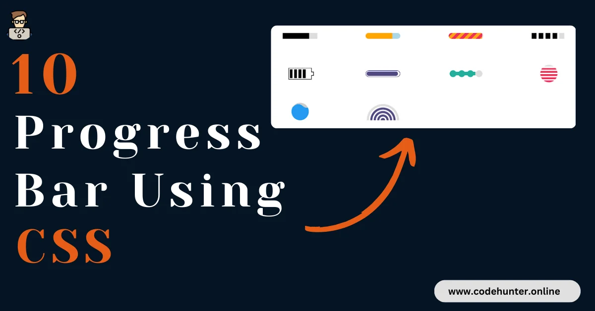
Progress / Loading Bar
A progress bar is a graphical user interface (GUI) element used to visualize the progression of a task. It provides a visual representation of the completion status of an operation, indicating how much of the task has been completed and how much is remaining.
Typically, a progress bar consists of a filled portion, which represents the completed portion of the task, and an unfilled portion, which represents the remaining or incomplete part.
Progress bars are commonly used in software applications, web interfaces, and various other contexts where it’s beneficial for users to understand the status of ongoing processes, such as file downloads, software installations, or form submissions.
The progress bar serves as a visual indicator, offering users feedback on the duration and status of a task, helping manage expectations, and providing a sense of completion as the task progresses. It is a valuable user interface element for enhancing user experience and communication during various operations.
Type Of Progress Bar
There are various types of progress bar designs, each offering a unique visual representation of the progression of a task.
1. Linear Progress Bar:
- This is the most basic and common type. It consists of a straight line that fills up as the task progresses.
2. Circular Progress Bar:
- Circular progress bars are displayed in a circular shape, often filling up a ring or pie chart as the task advances.
3. Determinate Progress Bar:
- A determinate progress bar shows a clear indication of the exact percentage of completion. It often includes numerical information to specify the progress percentage.
4. Indeterminate Progress Bar:
- Unlike determinate progress bars, indeterminate ones don’t provide a clear percentage indication. Instead, they display continuous motion to signify ongoing activity without a specific endpoint.
5. Buffered Progress Bar:
- Buffered progress bars show the progress of the task as well as secondary buffer progress, providing an additional layer of information about the task’s loading or processing.
6. Step Progress Bar:
- Step progress bars break down a task into distinct steps, and each step is completed one at a time. Users can see progress through individual stages of a process.
7. Animated Progress Bar:
- Animated progress bars use dynamic visuals or animations to convey progress. These might include moving gradients, pulsating colors, or other dynamic effects.
8. Text-Based Progress Bar:
- Instead of a graphical representation, a text-based progress bar uses text or numbers to convey progress. For example, showing “3 out of 5 items completed.”
9. Overlay or Modal Progress Bar:
- Sometimes, a progress bar appears as an overlay or modal dialog, providing feedback without disrupting the main content.
The choice of progress bar design depends on the context of its use, the type of task being represented, and the overall design aesthetics of the application or website. Selecting an appropriate design contributes to a better user experience by providing clear and meaningful feedback on ongoing processes.
About This Project
This project was created by the Code Hunter team to help students learn coding and programming. If you want to join our team please follow us on Instagram.
| Created by | Ahmed Developer |
| Languages | HTML and CSS |
| Source Code | Available Below |
| Preview | Take Preview |
| GitHub Link | Code Link |
How to Create a Progress Bar Using CSS
There are some steps to create this type of Progress Bar Animation Using HTML, and CSS, that is given below. Follow these steps.
- The first step is to create one folder.
- Open this folder in Vs Code Editor and create two (2) files in HTML and CSS.
- Make sure the HTML file extension is (.html), and the CSS file extension is (.css).
- After creating files, you link a CSS file with an HTML file with the help of this line code. (<link rel=”stylesheet” href=”style.css”>)
- The last step is copying and pasting the given code into your files.
Video Tutorial
If you want to learn more about this project please watch this video and also subscribe to this YouTube channel for more content like this. This video is provided by Web Dev Simplified.
Progress Bar Animation Using HTML and CSS – Source Code
HTML FILE
<!DOCTYPE html>
<html lang="en">
<head>
    <meta charset="UTF-8">
    <meta name="viewport" content="width=device-width, initial-scale=1.0">
    <title> Progress Bar Css Animation </title>
    <link rel="stylesheet" href="style.css">
</head>
<body>
    <div class="progress-1"></div>
 <div class="progress-2"></div>
 <div class="progress-3"></div>
 <div class="progress-4"></div>
 <div class="progress-5"></div>
 <div class="progress-6"></div>
 <div class="progress-7"></div>
 <div class="progress-8"></div>
 <div class="progress-9"></div>
 <div class="progress-10"></div>
</body>
</html>
CSS FILE
.progress-1 {
    width:120px;
    height:20px;
    background:
     linear-gradient(#000 0 0) 0/0% no-repeat
     #ddd;
    animation:p1 2s infinite linear;
   }
   @keyframes p1 {
     100% {background-size:100%}
   }
   .progress-2 {
    width:120px;
    height:20px;
    border-radius: 20px;
    background:
     linear-gradient(orange 0 0) 0/0% no-repeat
     lightblue;
    animation:p2 2s infinite steps(10);
   }
   @keyframes p2 {
     100% {background-size:110%}
   }
   .progress-3 {
    width:120px;
    height:20px;
    border-radius: 20px;
    background:
     repeating-linear-gradient(135deg,#f03355 0 10px,#ffa516 0 20px) 0/0%  no-repeat,
     repeating-linear-gradient(135deg,#ddd  0 10px,#eee  0 20px) 0/100%;
    animation:p3 2s infinite;
   }
   @keyframes p3 {
     100% {background-size:100%}
   }
   .progress-4 {
    width:120px;
    height:20px;
    -webkit-mask:linear-gradient(90deg,#000 70%,#0000 0) 0/20%;
    background:
     linear-gradient(#000 0 0) 0/0% no-repeat
     #ddd;
    animation:p4 2s infinite steps(6);
   }
   @keyframes p4 {
     100% {background-size:120%}
   }
   .progress-5 {
    width:80px;
    height:40px;
    border:2px solid currentColor;
    border-right-color: transparent;
    padding:3px;
    background:
     repeating-linear-gradient(90deg,currentColor 0 10px,#0000 0 15px)
     0/0% no-repeat content-box content-box;
    position: relative;
    animation:p4 2s infinite steps(6);
   }
   .progress-5::before {
    content:"";
    position: absolute;
    top:-2px;
    bottom:-2px;
    left:100%;
    width:10px;
    background:
     linear-gradient(
       #0000  calc(50% - 7px),currentColor 0 calc(50% - 5px),
       #0000 0 calc(50% + 5px),currentColor 0 calc(50% + 7px),#0000 0) left /100% 100%,
     linear-gradient(currentColor calc(50% - 5px),#0000    0 calc(50% + 5px),currentColor 0) left /2px 100%,
     linear-gradient(#0000    calc(50% - 5px),currentColor 0 calc(50% + 5px),#0000    0) right/2px 100%;
    background-repeat:no-repeat;
   }
   @keyframes p5 {
     100% {background-size:120%}
   }
   .progress-6 {
    width:120px;
    height:22px;
    border-radius: 20px;
    color:#514b82;
    border:2px solid;
    position: relative;
   }
   .progress-6::before {
    content:"";
    position: absolute;
    margin:2px;
    inset:0 100% 0 0;
    border-radius: inherit;
    background:currentColor;
    animation:p6 2s infinite;
   }
   @keyframes p6 {
     100% {inset:0}
   }
   .progress-7 {
    width:120px;
    height:24px;
    -webkit-mask:
     radial-gradient(circle closest-side,#000 94%,#0000) 0 0/25% 100%,
     linear-gradient(#000 0 0) center/calc(100% - 12px) calc(100% - 12px) no-repeat;
    background:
     linear-gradient(#25b09b 0 0) 0/0% no-repeat
     #ddd;
    animation:p7 2s infinite linear;
   }
   @keyframes p7 {
     100% {background-size:100%}
   }
   .progress-8 {
    width:60px;
    height:60px;
    border-radius: 50%;
    -webkit-mask:linear-gradient(0deg,#000 55%,#0000 0) bottom/100% 18.18%;
    background:
     linear-gradient(#f03355 0 0) bottom/100% 0% no-repeat
     #ddd;
    animation:p8 2s infinite steps(7);
   }
   @keyframes p8 {
     100% {background-size:100% 115%}
   }
   .progress-9 {
    --r1: 154%;
    --r2: 68.5%;
    width:60px;
    height:60px;
    border-radius: 50%;
    background:
     radial-gradient(var(--r1) var(--r2) at top  ,#0000 79.5%,#269af2 80%) center left,
     radial-gradient(var(--r1) var(--r2) at bottom,#269af2 79.5%,#0000 80%) center center,
     radial-gradient(var(--r1) var(--r2) at top  ,#0000 79.5%,#269af2 80%) center right,
     #ccc;
    background-size: 50.5% 220%;
    background-position: -100% 0%,0% 0%,100% 0%;
    background-repeat:no-repeat;
    animation:p9 2s infinite linear;
   }
   @keyframes p9 {
     33% {background-position:  0% 33% ,100% 33% ,200% 33% }
     66% {background-position: -100% 66%,0%  66% ,100% 66% }
     100% {background-position:  0% 100%,100% 100%,200% 100%}
   }
   .progress-10 {
    width:120px;
    height:60px;
    border-radius:200px 200px 0 0;
    -webkit-mask:repeating-radial-gradient(farthest-side at bottom ,#0000 0,#000 1px 12%,#0000 calc(12% + 1px) 20%);
    background:
     radial-gradient(farthest-side at bottom,#514b82 0 95%,#0000 0) bottom/0% 0% no-repeat
     #ddd;
    animation:p10 2s infinite steps(6);
   }
   @keyframes p10 {
     100% {background-size:120% 120%}
   }
   /**/
   body {
    display: grid;
    grid-template-columns: repeat(auto-fit,minmax(250px,1fr));
    grid-auto-rows: 130px;
    place-items:center;
   }
   * {
    box-sizing: border-box;
   }
Related Content
- How To Create a Profile Card Using HTML and CSS – Complete Source Code
- Build an Interactive Responsive Navigation Bar with HTML, CSS, and JS – Free Source Code
- How to Create Animated Social Icon With Hover Effect using HTML and CSS
Final Words
These 10 HTML and CSS-based progress bar animations offer creative ways to enhance user experience. From linear and circular designs to step indicators, the variety allows customization based on project needs.
With simplicity and lightweight implementation in mind, these animations contribute to visually pleasing and engaging web interfaces, demonstrating the power of HTML and CSS in creating seamless user journeys.